Chefaa is rebranding
and it’s not just about a logo.
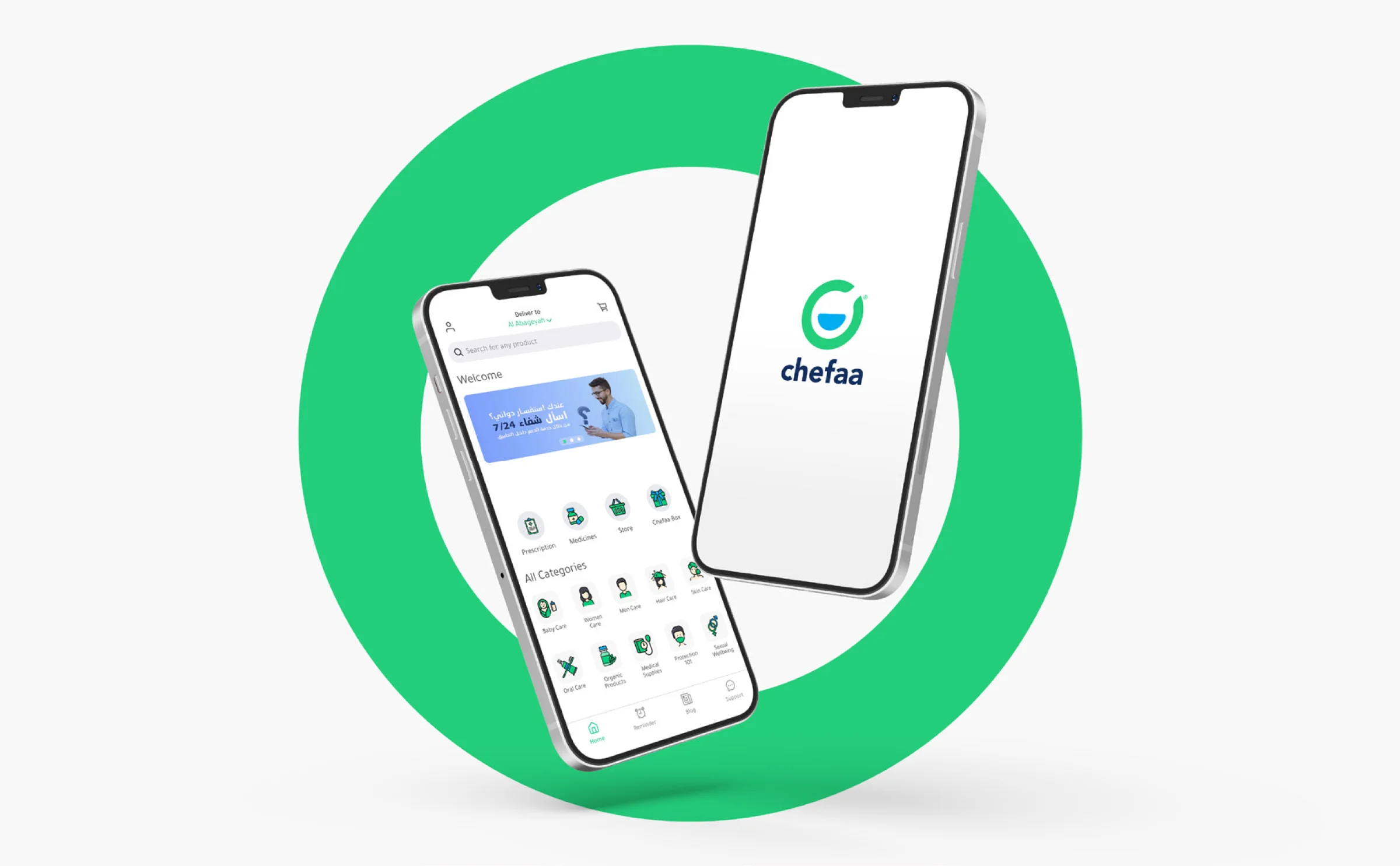
Launched in 2018 by two hard working and ambitious female entrepreneurs, Doaa Aref and Dr. Rasha Rady, Chefaa is a pharmacy delivery platform to help chronic patients order, schedule and refill recurring prescriptions as well as manage all their pharmacy needs.
In two years, Chefaa has served hundreds of thousands of patients who have trusted chefaa to help them secure their recurring prescriptions safely, & sustainably. Chefaa services are designed around chronic patients’ lives; timely access to their prescriptions, 24/7 support by licensed pharmacists, dosages reminders so that they never miss a dosage and Arabic-speaking educational posts on Chefaa blog. Recently, Chefaa introduced a new brand positioning; to serve chronic patients timely, sustainably and hassle-free, towards a better quality of life and better treatment compliance.
And with the new brand positioning came a new brand identity that was designed by Tarek Alzeeny to capture Chefaa focus on serving chronic patients and helping them manage all their pharmacy needs easily.
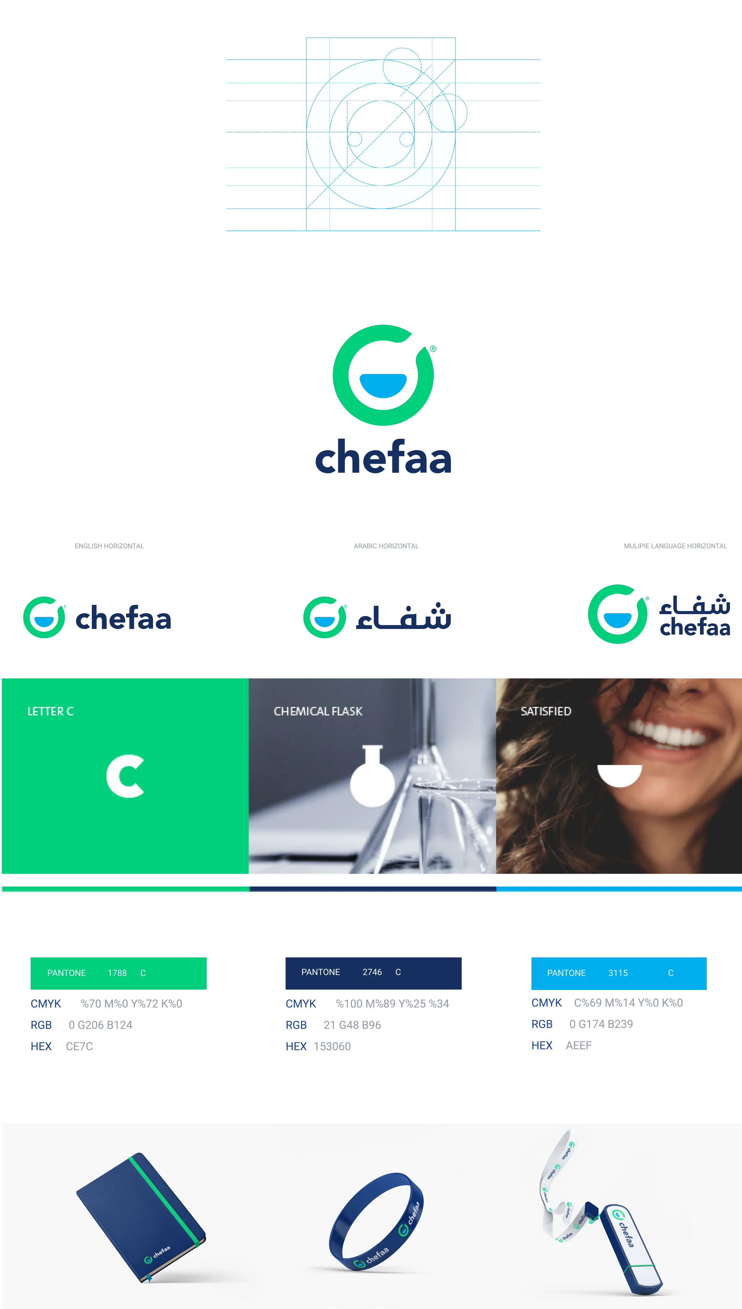
Chronic illness could be forever but that is more reason chronic patients would need a service that is timely, easy and safe. This shall help improve their compliance to their life-long treatment and ultimately, outcome. Chronic patients’ pharmacy needs are not limited to their prescribed drugs, but to have a better quality of life, they need non-pharmaceuticals as well. All of which deserve to be offered timely, easily and sustainably and thus, Chefaa Box The meaning behind the logo : Easy, Timely, Chronic.
The old logo, a green leaf taking the shape of the letter ” C”, just represented the naivety of a start-up in its early stage. It was clear to the founders that they wanted chronic patients to get their prescriptions regularly but to non Arabic speakers who didn’t know the meaning of Chefaa, and others who just looked at the symbol and not the name below, a leaf was a symbol closer to agriculture than pharmaceuticals and the letter “C” just emphasized their initial understanding of the word “chef”. Simple as it is, many had first impressions for a food industry startup before knowing the name and getting wowed by the impact. So it was important to have a new logo to fully represent a story; story of the life-long journey Chefaa chooses to take with chronic patients towards a better quality of life.
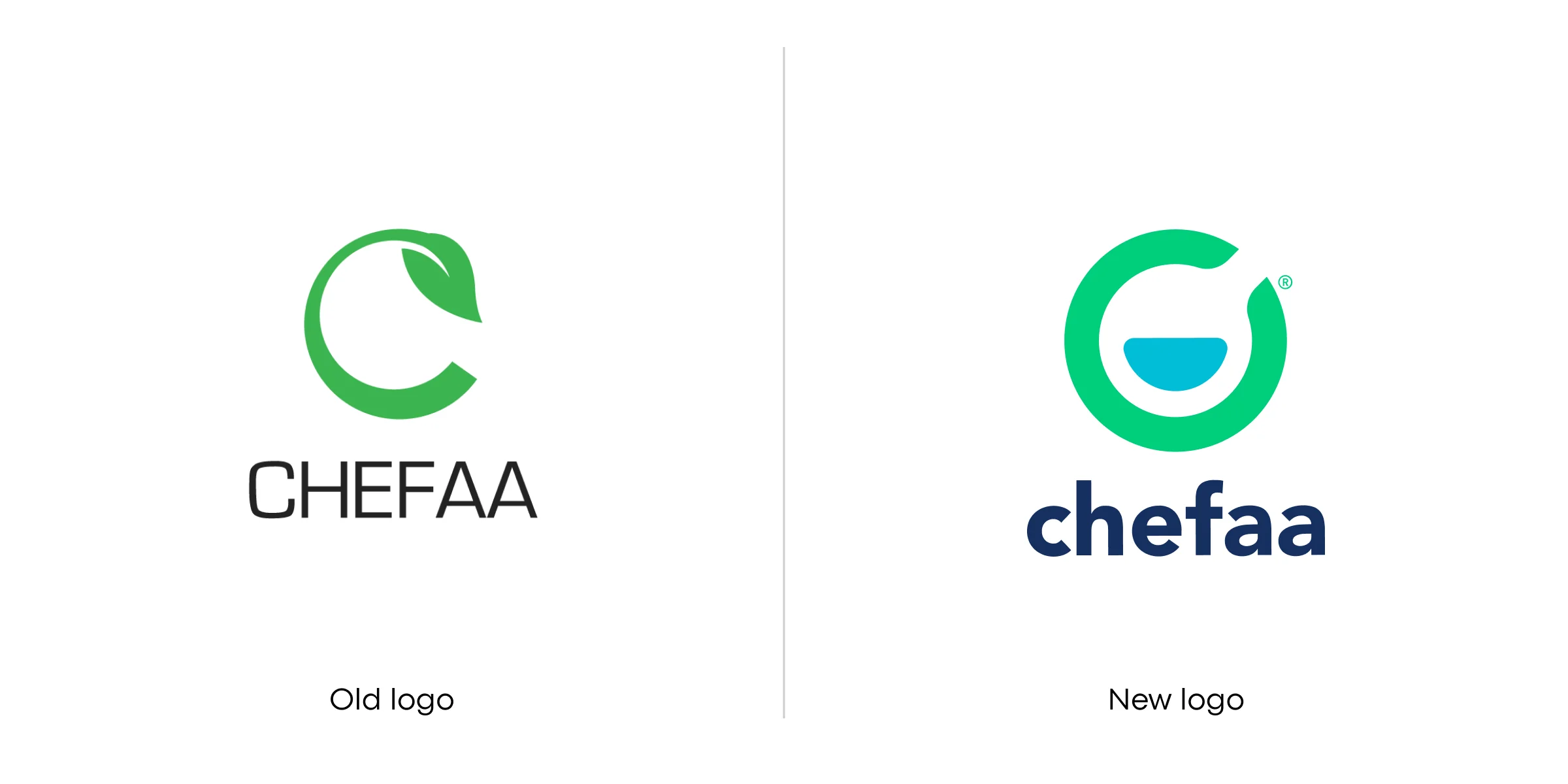
Chefaa has always started with letter ” C”, but in the founders’ minds that represented both “Cure”, which is the English translation for Chefaa, and “Chronic” which is their target segment of patients. But as they grow, learn and scale, it became very clear that the letter ” C” shall reflect more; “Change”, which happens to be the only “Constant”.